Consumer money app
Veyra
A money app that starts with what can be spent now.
- Platforms
- iOS and Android
- Engagement
- All delivered under NDA to private clients, who own what we built. Screens are representative: no client names, no user data.
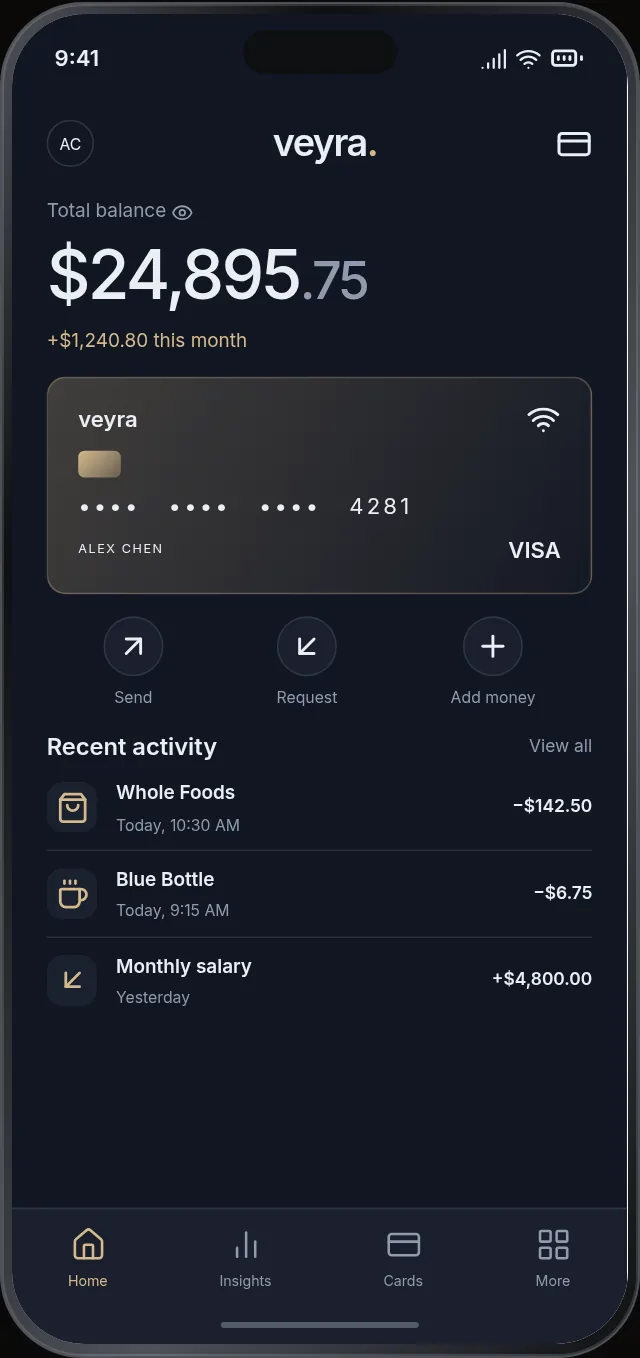
Built for people who want a clearer account of everyday spending than a bank app gives. The balance, its change over the month and the activity behind it share one screen.
The problem
Bank apps list transactions without saying what they add up to. A balance that still includes bills due looks available when it is not, and the gap shows only when a payment fails.
What we decided
The home screen states the balance first, then the change over the month, then the activity behind both.
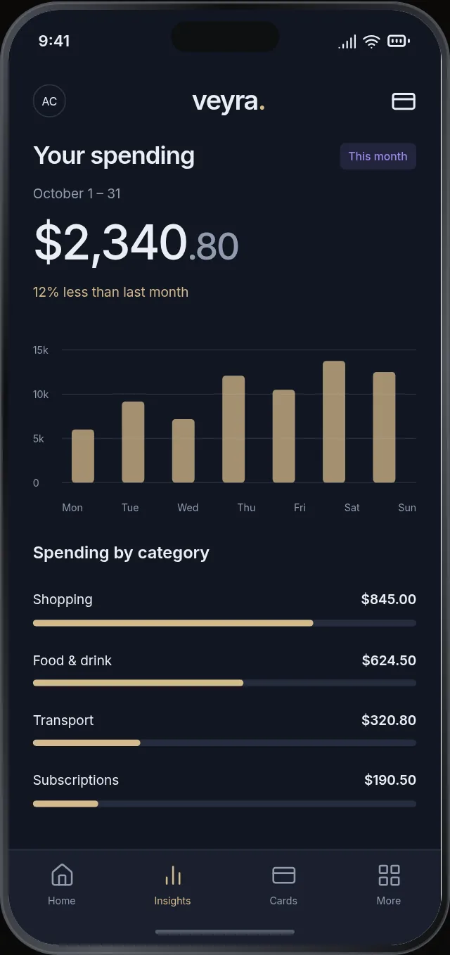
Spending is grouped by category and set against the previous month.
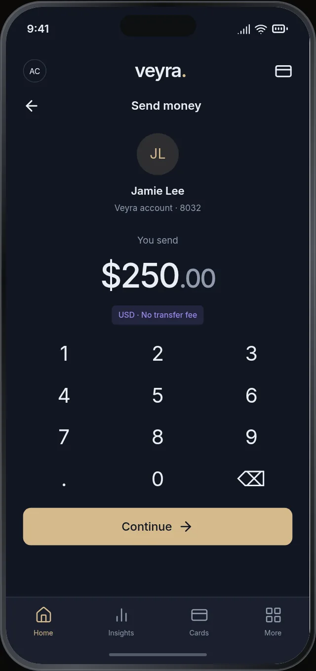
Transfers keep recipient, amount and fee in view together, with a keypad sized for one hand.
Card controls sit beneath the card itself, not in a settings area.
A dark field with one accent color keeps amounts legible at small sizes.